ASHT Rebrand: Inclusive Branding for Upper Extremity Therapists | AH
The need for a more inclusive brand
Branding is an incredibly important element for any group. Does it represent the organization? Does it illustrate the mission? Does it show a consumer what they’re in for? All of these questions go through a potential consumer’s head upon first interaction, because the brand can tell the whole story. So what makes an organization want to rebrand? The mission of an organization can shift, causing its reflection in the brand to become outdated. It could simply be a shift to a newer, more modern brand, but for the American Society of Hand Therapists (ASHT), a shift to a more inclusive representation of the organization was warranted.
About the American Society of Hand Therapists (ASHT)
The American Society of Hand Therapists is an organization of professionals dedicated to advancing the field of hand and upper extremity therapy. The members include occupational and physical therapists, surgeons, researchers, and administrators. ASHT’s previous brand had been around for a few decades, carrying the organization’s name with an unintentional falsehood: that “hand therapists” treat only the hands. The previous logo included a visual of two hands, but nothing that illustrated the upper extremity (hand, wrist, arm, elbow, and shoulder) as a whole. “The previous brand was fairly inconsistent — we had to create unity between all of the pieces that were already there,” said Jenelle Kleiman, Creative Manager at Association Headquarters (AH). “When the time came for a rebrand, the idea was to include the clinical treatment area above the hand, as hand therapy is about so much more than just the hand — and we wanted to show that in the logo.”
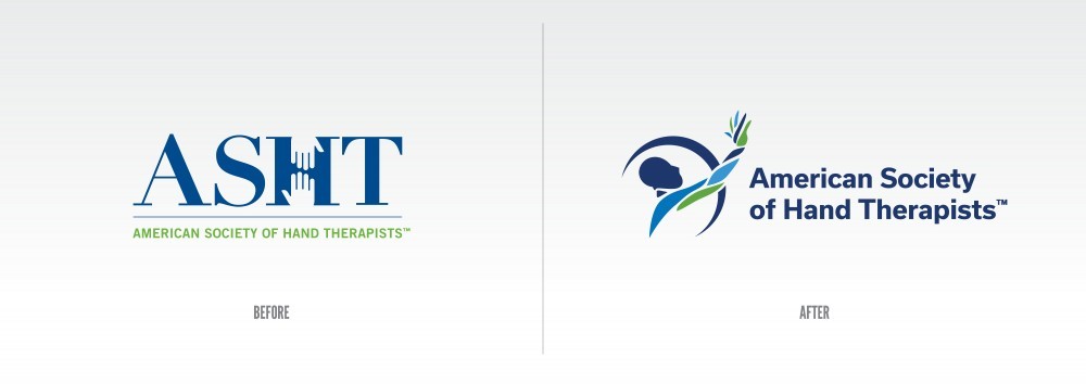
The previous ASHT logo contained visuals of two hands, but no inclusion of the clinical treatment area above the hand. The new logo contains visuals of the entire upper extremity (hand, wrist, arm, elbow, and shoulder) and properly reflects the work of the specialty.
Creating a new identity that reflects the full scope of ASHT
The nature of human anatomy shows that one extremity is never siloed on its own — everything works together, which is incredibly apparent when it comes to the hand. The shoulder, upper arm, elbow, forearm, wrist, and hand are interconnected, and all collaborate to allow the upper extremity to function. This was the driving force behind rebranding — to show the entire upper limb represented properly, including all members’ individual specializations.
The process of rebranding can be a difficult one — getting designers and leadership volunteers to agree to one final design can require a lot of back-and-forth, but the end product is almost always worth it. Traditionally, a rebrand is discussed between a graphic designer, creative team, and the organization, allowing the client to provide a direct line of artistic inspiration to those creating the brand. “The idea of anatomically representing the upper extremity while remaining abstract was a challenge, but with every draft review, the idea became more and more refined,” said Kleiman. “On such collaborative efforts, it may seem intimidating to design in a subject that’s not necessarily in your expertise, but that’s where the magic happens. Clients are able to give you some malleable ideas, which you can form into a solid product.”
In projects as large as a rebranding, it’s important to have a North Star to guide you. Embracing feedback is a normal occurrence for creative teams, but it’s what guides the brand to its eventual success. Collaboration and a mutual understanding between subject matter experts and designers is what truly carries brands to the next level.
Based on their initial feedback, the members of ASHT wanted the new branding to better reflect the work of the specialty. In the previous logo, there were countless specialties that were left out by the sole depiction of the hand — shoulder specialists and elbow specialists weren’t properly represented, for example. The previous brand being so hand-centric reduced what ASHT stood for, mislabeling the organization. “Practitioners of the specialty can still be referred to as ‘hand therapists,’ as this is the colloquial term, but we felt it important to be clearer in the most forward-facing part of the brand, our logo,” said Gene Terry, CAE, IOM, Executive Director of ASHT.
The outcome: increased engagement and renewed brand pride
Industry research shows that rebranding every 7-10 years to represent your ever-changing brand accurately is common, but due to ASHT’s respected legacy, they held on until they felt the moment was right to reimagine the brand. In 2021, ASHT and its volunteer leaders decided it was finally the right time to rebrand the organization with more accurate visuals and updated messaging to reflect the specialty. Months of 2021 were spent on this reimagining, which was slated to be revealed at the 2021 ASHT Annual Meeting.
“At the start of the meeting, ASHT was still branded with the old logo. The board presented its logo during their business meeting, and it received a standing ovation. During the session, the ASHT staff team switched out the branding by replacing signage and donning fleece jackets with the new logo so all of the members would be immersed in the new feel of ASHT after the unveiling,” said Terry.
The new ASHT brand won the 2021 Graphic Design USA Awards shortly after its debut, showing merit in the power of proper inclusivity paired with great design. Now, with a brand that properly represents those in hand and upper extremity therapy, ASHT can move forward as a brand that represents the specialty equally.
“A logo is everything for a first impression. It's the first individual touchpoint for a potential member or consumer,” said Kleiman. “Because it’s so visual, the logo needs to say the right thing without saying anything.”
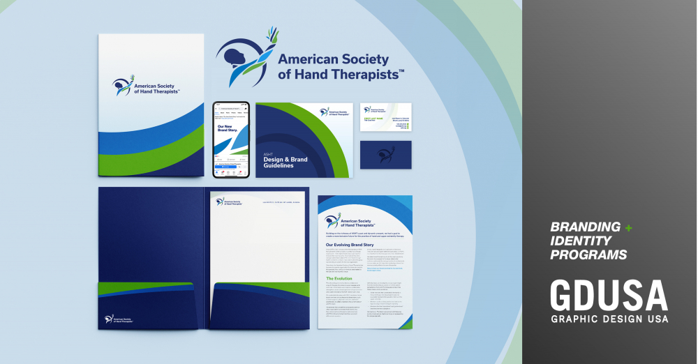
ASHT's new brand won a 2021 GDUSA’s American Graphic Design Awards™ in the category of branding and identity programs.
Get in touch:
Is your association ready for a rebrand? Reach out today.