
With the proliferation of various types of smartphones, tablets, laptops and other devices with web access, more and more associations are turning to responsive web design to effectively reach their target audiences.
Responsive design is the concept that a website should move and change to fit the screen resolution you’re viewing it from; the same website that looks great on your widescreen monitor will also look great on your iPhone without pinching and zooming to read the site. And rather than building a native application that’s optimized for a specific device (and would essentially mean you’d have 5-10 different versions of one site), responsive design optimizes a website and future-proofs a website as smartphones and tablets continue to evolve.
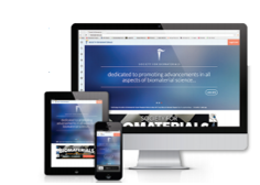
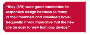
At AH, several of our client partners were interested in developing new sites and were great candidates for responsive design. One client partner, the Society For Biomaterials (SFB), planned to switch to a new member database and redesign their website at the same time. They (SFB) were good candidates for responsive design because so many of their members and volunteers travel frequently. It was imperative that the new site be easy to view from any device.
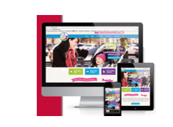
Another client partner, the Juvenile Products Manufacturers Association (JPMA) was in the early stages of developing its consumer-facing site, Baby Safety Zone. Baby Safety Zone is a site for new, busy parents who are likely unable to sit in front of a laptop or desktop and leisurely surf the web. Instead, they will likely visit Baby Safety Zone from a smartphone when they have a few minutes to spare. The site would also include a certified baby products directory that JPMA wanted moms to be able to browse while they shop—all of which made it an excellent candidate for a responsive design.
Before the web team could move ahead with developing responsive sites, they had to sell it to the client partner teams. Each team was aware that it’s becoming more common for members to view their websites on tablets and smartphones rather than a traditional desktop. With that in mind, it was a relatively easy sell—why not choose one solution that is scalable?
Of course, any new technology has its set of challenges. One challenge the web team faced when consulting with the client partner teams and volunteer leaders was helping them envision exactly what the site would look like in its completed state. Since responsive design sites scale to fit any screen, content shifts and formats differently depending on how you view the site. Typically, designs are developed in a grid style where elements can transition from being wide to vertically long.
Then, there’s the stigma associated with scrolling and the myth of “above the fold” content. It was thought that if a user has to scroll through a website it will fail—a user would never scroll through a website and click on a call to action. Numerous studies conducted have debunked this myth; in fact, scrolling through websites is the current web trend.
Clear communication with the client teams and volunteer leaders helped to get through these challenges and both SFB and JPMA were incredibly pleased with their new, scalable responsive design websites!
SFB’s pages per session increased after their responsive website went live and their bounce rate decreased. Visitors were likely more comfortable browsing when they reached a site that was easy to read and navigate.
Baby Safety Zone analytics show that 40 percent of their visitors view the site on a mobile device, as predicted, and those numbers continue to grow