by Mark Denato, Creative Director
A brand is a company’s personality. It’s the way a company looks and feels, the way a company speaks, and it’s what clients — and anyone else — think about them.
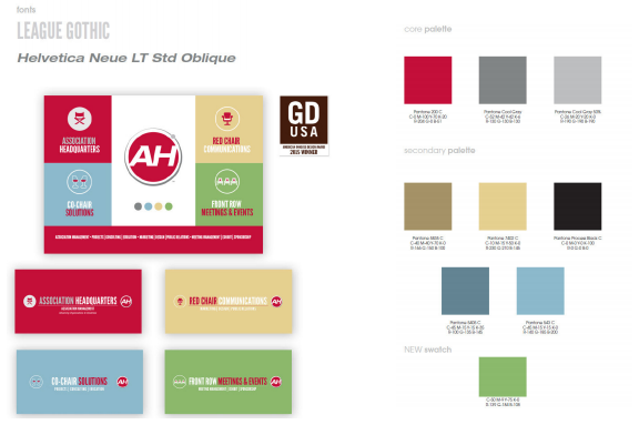
AH recently introduced a new positioning for expanding its brand, which included the development of four main divisions within AH: full-service association management (Association Headquarters), a marketing and communications agency (Red Chair Communications), a meetings and events management team (Front Row Meetings & Events), and a division that focuses on custom solutions (Co-Chair Solutions).
The challenge, from a design standpoint, was to create the identity for the new divisions, while still maintaining a consistent look and feel to the original brand.
The AH branding guide has a section on AH’s color palette, which includes a core palette, and a secondary palette. This was extremely helpful in building upon the existing brand. But, there was still more needed. Another color (green) was added which complemented the secondary palette.
A new font was introduced to the division logos, League Gothic. The font distinguished the new divisions and looked consistent when paired with the original brand’s font of Helvetica Neue LT Std Bold Extended Oblique.
The AH circle shape and the AH red were going to be the constant throughout all the divisions and the main corporate brand. The main icon graphic in each division is white and red, and centered, just like the original AH. The red and gray colors are also used in the font treatment of each division.
The result was a refreshing new corporate identity, which is bright and engaging, while still maintaining the core values of the original brand design. The design was well received within the company and a success outside the company — as it won a Graphic Design USA InHouse Design Award.