
What does the imagery used for conference graphics say about an organization?
For a typical association, the graphics are designed to feature the meeting location. Everything–Save the Date cards, registration brochures, web banners, meeting program books–uses a central design based on, well, geography. Think about some recent conferences. Where were these meetings, and what did the art for the meeting look like? Chances are good that if the conference was in Seattle, the Space Needle was prominently shown on the brochure. If it was in San Antonio, the Alamo was probably featured. If (insert any city name here), a skyline of the city was used.
This isn’t a criticism of the designers following the demands of the client. For many years, association leaders have believed playing up the location of the meeting draws more attendees. It is assumed a great location means great attendance. They are correct, but it’s the name of the city, not the graphic, that does the job. Members will flock to a meeting in San Francisco even without seeing a depiction of the Golden Gate Bridge on the web banner. They just want to come to San Francisco.
What do your meeting graphics say about you?
If you took the association’s name off of the brochure, does the remaining information convey a sense of the organization? If the name could be removed and any other association’s name dropped into the same spot in the design, the association is missing an opportunity to tie its brand to the meeting.
A few years ago, Association Headquarters (AH) brought a new concept to one of its client partners, the Society For Biomaterials (SFB). In 2009, the Society For Biomaterials engaged in a branding exercise to develop a new tagline. After a multitude of drafts and suggestions from senior leaders and staff, it was decided the best way to identify the organization’s brand was to get input from the members, so a contest was held. A few short weeks later, the winning tagline was adopted by the Board, and a new branding campaign was launched. To understand the following, it is important to note the members of SFB work in the field of biomaterials, researching, developing, improving, manufacturing and providing medical devices that have made a difference in the lives of millions of people. These are knee, hip and joint replacements, dental implants, artificial heart valves, targeted drug delivery for cancer treatments and many, many other such items.

Getting started on meeting branding
The winning entry from the branding contest was “Giving Life to a World of Materials.” This tagline was 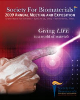 used on all Society materials, including its logo, both for the meeting and all future purposes. It became the theme of the 2009 annual meeting, and the meeting graphic was designed to reflect the tagline, not the location (San Antonio). The graphic was developed around a concept originally portrayed in Michelangelo’s fresco of creation on the Sistine Chapel. SFB’s members loved this new approach. The concept was off and running.
Building on success
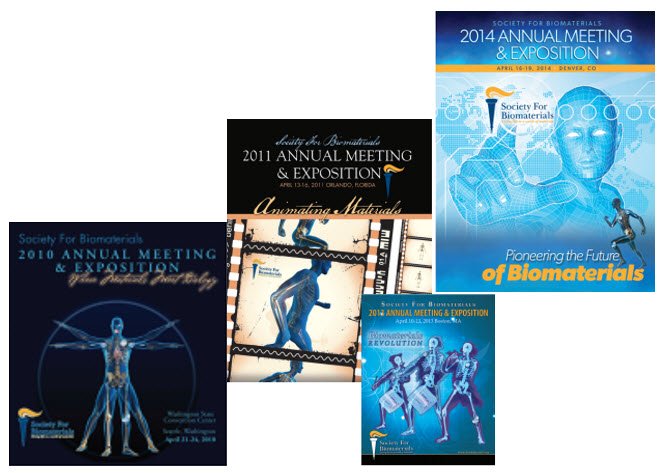
In 2010, a modernized version of daVinci’s Vitruvian Man was used, portraying biomaterial implants and using the meeting theme “Where Materials Meet Biology.” Meeting attendance broke SFB records, possibly because of the location (Seattle), without a single Space Needle image used anywhere.
At this point, the trend was established, and the Society leaders were sold on the idea that the brand, not the location, should drive meeting graphics. But that’s not to say location has to be ignored. AH was able to do both in 2011, when SFB’s meeting was held in Orlando, Fla., on the grounds of a Disney resort. This time, the Disney tradition was invoked with the theme “Animating Materials,” and a graphic featuring the blue man with implants alluded to famous Disney animated films.
Every fourth year, SFB does not hold its annual meeting in deference to the World Biomaterials Congress, and 2012 was one of those years, so, skipping ahead to 2013, the Boston meeting graphic continued blending location with branding to feature the theme “Biomaterials Revolution.” The well-known drawing of three Revolutionary War soldiers was adapted to include the now-familiar blue-man-with-implants brand.
For 2014, SFB’s Denver meeting has the boldest graphic so far, illustrating the theme, “Pioneering the Future of Biomaterials,” with an homage to the pioneer history of the meeting location. The blue man is back, but with a distinctly futuristic twist.
Moving forward
With AH’s help, the Society For Biomaterials has clearly linked its brand with its meeting locations and is committed to continuing this successful approach. Members and non-members alike have come to associate the adapted blue man images with SFB and its annual meetings. Gone forever are the anonymous program covers showing city skylines.
Consider what represents your organization at its core and how it might be adapted to begin creating a brand that can be coordinated with your meeting locations. What you do is more important than where you meet, but it is possible to represent them together. Your brand should be more than geography.