When evaluating the effectiveness of your logo, keep these points in mind.
Throw out the names of a few big, institutional brands—Target, Starbucks, FedEx—and it’s likely their respective logos flash in your mind. While the ease of recall makes the case for strong branding, the logo itself is an excellent example of logo design done right. These institutional logos stand the test of time for a few key reasons to keep in mind when your association evaluates the state of its logo.
A Matter of Identity
“A logo is a visual piece in a bigger brand identity system,” wrote Tobias van Schneider, designer and entrepreneur, in a blog post about logo and brand identity. This visual piece, however, is the launch pad for countless other aspects of a brand—the visual and communication components that help distinguish your organization from competitors. In addition to making your organization recognizable, a logo communicates an organization’s purpose and makes a lasting impression on an audience. When considering whether a logo is effective, or when undertaking a new endeavor that requires a fresh start, be careful not to underestimate the power of the logo to do the talking for you.
“The logo basically comprises an organization’s purpose,” said Justin Fennelly, Senior Graphic Designer at AH with more than 15 years of experience designing for associations and nonprofits. The overall aesthetic of the logo will set the stage for how people experience the organization. “Take the Toys R Us logo, for example,” said Fennelly. “It’s childlike, from the colors to the type. You’re not going to think they’re a defense contractor—everything about their logo is speaking toward purpose.”
While not all organizations are empowered with an obvious moniker like Toys R Us, those with more abstract names can still make good use of a logo to tell their story. “A successful logo is going to convey whatever concept an organization wants to display,” said Jason Parrish, a senior-level graphic designer in the medical device industry and brand design expert with more than 14 years in the design field. “Case in point: Starbucks. You hardly see the words but everyone knows the mermaid logo and thinks of coffee. If you’re successful in your branding, stick to the concept and really sell it, people will get the idea and come to associate it with your organization.”
The Elements of Design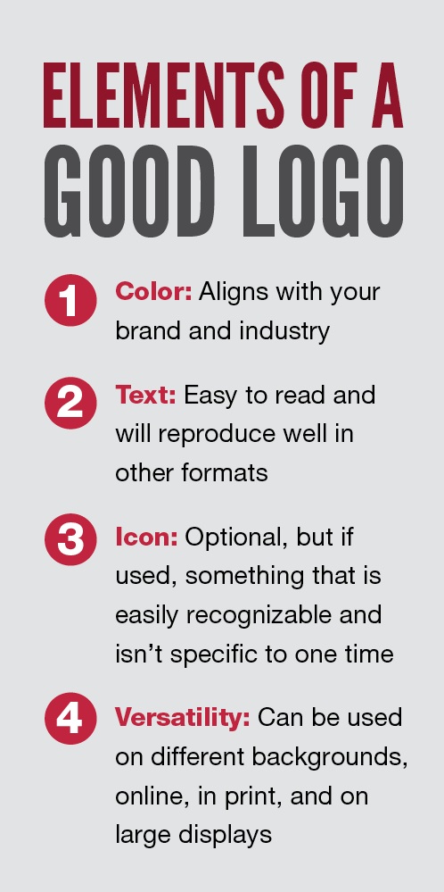
Both Fennelly and Parrish note that the single most important consideration in logo design is knowing what audience you’re hoping to attract. “Whether an organization is just starting out or has grown and evolved over time, leadership needs to consider what the organization is trying to say and who it wants to connect with,” said Parrish. The answer will dictate almost every other aspect of the logo’s design.
Color is one of those key elements. “The psychology of color can be overwhelming,” said Fennelly. “Color is one of those ways you can convey a lot of information, so it’s important to know what your options are.”
Logo designers will choose colors based on how an organization wants to be perceived. “When I’m working with a client, I’ll ask, ‘How do you want to present yourself?’” said Parrish. “Medical organizations are going to use a lot of blue because it’s trustworthy and neutral. Or green, which can represent growth, health and energy.” Red, which both Fennelly and Parrish say can be tricky, may evoke feelings of passion and intensity in addition to being a stand-out color. “No one wants a logo that’s too soft or subtle to be remembered,” said Parrish. “Red can be used strategically to give a logo that little something extra to make it stand out.”
And while color is a key element to creating an emotional connection with an audience, even the shapes used in a logo can say something about the organization. “There’s an emotional response to shapes just like there is with color,” said Fennelly. “Sharp lines and edges make us think of strength, stability, power, something unbreakable. That’s going to be ideal for banking, law, things that are rigid and firm. Circles and ovals are softer. You think of unity and community.”
Tweet This: A logo is part of an active, living organization. It needs to be working for you & communicating to your audience. https://ctt.ec/e7uYa+
Associations need to consider how specific their logo needs to be. “We thrive on specificity in the association space,” said Fennelly. “Some of these are concepts that don’t illustrate that easily. There probably isn’t an adequate shape or icon to convey something like a specialized type of nursing or a really niche trade. When you need to get that granular, it’s important that your logo helps you get noticed and helps people understand who you are.” Accepting that not every logo can or should be iconic is an important step in creating a logo that has staying power.
Now and Forever
There’s another consideration that goes beyond color, shape and type: timelessness, or the overall design aesthetic of the logo. “People talk about timeless design, but what is it, really?” asks Parrish. “Timelessness is very difficult to achieve when you set that as a goal at the beginning of the process.” A better place to start, he says, is determining what problem you need the design of your logo to solve. The right solution will be timeless.
“There’s something to be said for coming out of the gate strong,” said Fennelly. “If you have to go back and fix a bad logo, it’s going to do more damage than if you had really thought through your needs and took the time to get it right.”
But there are a few universal qualities of a timeless design. Avoiding references to things that are of a specific time—certain font styles or images that may be incorporated as icons—can save you from having to revise an outdated logo in just a few years. Ultra-clever designs come across as idealized and ultimately don’t work for the long-haul.
Tweet This: Make a design change to meet a certain goal, not just because you're bored. https://ctt.ec/1ahH9+
All of this isn’t to say that logos should be void of design trends. Parrish advises that companies stick with design trends that have proven to be successful. “People don’t really like to commit to certain design solutions, often worrying that there could be a better design or trend,” he said. “But I’m always an advocate for acknowledging designs people think are effective and incorporating those trends in logo design.” And when a board is paralyzed with fear of being too different from the competition, Parrish says a stand-out logo can avoid brand confusion and help the organization differentiate itself. “This is one of those times it can be OK to commit to being different,” he said.
However, no matter what design you land on, expect that an update is in your future. “Organizations change over time and goals shift, so a logo that may have felt timeless at one time needs an update eventually,” said Parrish.
Specifically speaking to associations, Fennelly notes that the changing leadership that comes with term limits and revolving board members can stagnate a logo. “It’s easy for volunteers to lose sight of the fact that the logo is part of an active, living organization,” he said. As new volunteer leaders come in, they’re often more focused on getting up to speed on operations or implementing the organization’s strategies than they are on considering the functionality and relevance of the logo. “There should be a trajectory to what you’re working with,” said Fennelly. “Timeless is one thing, paralyzed is another. A logo shouldn’t just exist—it needs to be working for you and communicating to your audience today.”
Refresh or Redesign?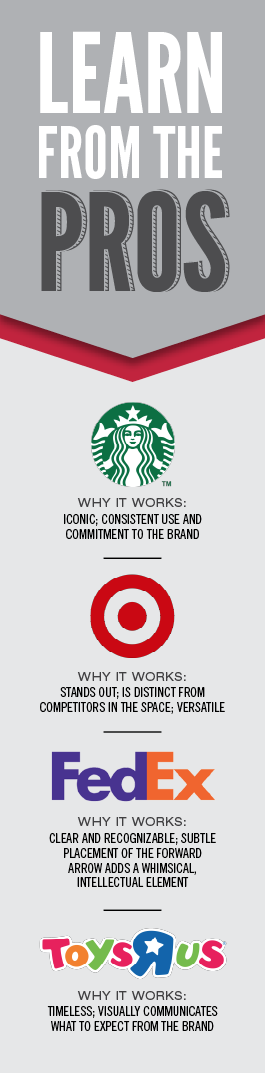
When it’s time to revisit your logo, organizations have two options: refresh the logo by incorporating some minor tweaks to modernize its overall look, or redesign it with a completely new look. Both options warrant consideration, though both Parrish and Fennelly advise caution when undertaking a redesign.
“A lot of companies have done a complete redesign and ended up with a disaster,” says Parrish. Notably, clothing retailer the Gap, whose redesigned logo garnered so much backlash it eventually revised again to something closer to its original. An important question to ask: Why do you feel a change is needed? “You might not need to take it that far,” said Parrish. “You want to know that if you’re going to change it’s to meet a certain goal, not change just because you’re bored with it.”
As an example of suspected boredom, Parrish highlights the newest iteration of Nationwide Insurance’s logo, which went from its admittedly bland-but-iconic blue window to an eagle. “I don’t know anyone who doesn’t think of Nationwide Insurance and think of that blue box,” said Parrish. “Now, they’re challenging consumers to make this connection [between an eagle and Nationwide] that didn’t exist before. You have to wonder why that change was made.”
Weighing whether to do a redesign or a refresh is a particularly precarious process for associations, especially those struggling to maintain relevance as membership dips and courting younger prospects becomes a challenge. Associations shifting focus or wanting to emphasize one facet of the organization over another face the delicate task of balancing an institutional brand with a need to be perceived as fresh. For example, incorporating the idea of community into branding that previously emphasized research or introducing a consumer-facing initiative by a trade association require balancing old and new priorities. “Take stock and think about how successful your brand is,” said Fennelly. “How far are you willing to drift from what you’re currently communicating? And how far do you really need to go?” Answers to these questions will help determine your next best move.
Final Considerations
After determining how trendy you want to be, and whether you’re launching a whole new look or just updating a classic, the final consideration influencing logo design is how the logo will be used. Above all things, the digital age requires logos to be versatile. “You can design a logo that looks great on stationary and in one particular position on your website, but you should be thinking about how it might look 6 feet high on a sign at your conference or as an icon for an app,” says Fennelly. “If you only design it for one or two uses today, you’re going to be in a tough spot a few years down the line. Even if you don’t think you want to use it that way, why would you hobble yourself and limit your future options? The idea should be that you’re designing something you can use for a while.”

Technology has made previously touchy design techniques a possibility today. “Years ago you’d want to
stay away from things like gradients, where colors fade, or even certain colors because they were difficult to reproduce,” said Parrish. “But we actually see more and more brands incorporating design elements that technology really made possible.”
Consider all the channels you may want to use your logo on, and ask for a version of the logo that will work. “If your logo is going on a dark or light background, or if you’re going to need it to be in black and white, get a version of the logo that will work,” said Fennelly. Keep track of approved logo variations in a branding guide, which spells out official colors, fonts and uses for logos and other brand elements.
An ideal logo design will be versatile enough to be used on a variety of channels without losing the feel of the brand or its connection with an audience. Which circles back to the first consideration in logo design: the audience. “You have a logo for a reason,” said Fennelly, of the challenge organizations face in helping their brand get recognized. “Let it convey the history or momentum you want people to get from your organization.” That visual connection can be the first step in establishing a relationship with the people poised to be the future of your association.
Download a PDF version of the article by clicking here.